Chart.js Time Scale Sample

The following chart is from a sample I found in the samples/timeScale folder of Chart.js Github repository. As far as I understand, the bundle version of Chart.js should include the moment.js as well. But I could not make the following code to work, without adding the moment.js from a CDN.

If you now how to make the bundled version to work, without using moment.min.js, please let me know to update the code.

Continue reading Chart.js Time Scale Sample

Chart.js Sample: Two Doughnut Charts

After updating the Blazing Charts plugin with the latest version of Chart.js, 2.2.2, I had to update these snippets. This is because everything is changed with that charting library.
If you are going to use the new version of Chart.js, be prepared to rewrite your scripts.

To draw two or more charts in one page, we have to consider a few points:

  • Javascript window.onload can be used only once. So if you want to run the scripts inside this function, you can collect all the scripts in one “chart snippet” and run it inside that function. Then introduce the chart divs for those charts in other chart snippets, and place it whenever the chart should goes.
  • Or you can use jQuery(document).ready(function() {…}); for each snippet
  • All the chart snippets will be included in one page. So if you repeat the same variable name in another snippet, it will override the last value you assigned to it. I recommend to use unique variable names in each snippet.
  • DIV id that you introduce to each script to draw a chart on, should be unique.

Continue reading Chart.js Sample: Two Doughnut Charts
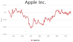
Using Highcharts.js to Draw a Dynamic Chart

Sometimes we need to draw a dynamic chart, which its value is continuously changing. Such a chart may represent a physical parameter, like the temperature of a tank, or the speed of a motor. Or it may show the price of a stock in stock market. Many sources provide Intraday and even tick data for free on the net. Google Finance, Yahoo Finance, NetFonds, Stooq, Dukascopy, and Finam are just a few to name.
The following dynamic chart shows the tick data of several stocks, read from Google Finance, or Yahoo Finance. Continue reading Using Highcharts.js to Draw a Dynamic Chart

Chart.js Sample: Polar Area Chart

Polar area charts are similar to pie charts, but each segment has the same angle – the radius of the segment differs depending on the value.

This type of chart is often useful when we want to show a comparison data similar to a pie chart, but also show a scale of values for context.

The following Polar Area Chart, drawn by Chart.js library:

Continue reading Chart.js Sample: Polar Area Chart